Our Favourite React Ecosystem
Patrik Szewczyk
23/12/2020
We know how difficult is to choose the right technologies and packages for the React application. Let us introduce you to our frontend ecosystem, custom packages, best practices, and further experience…

Hello, my name is Patrik. 👋
I live in the Czech Republic.🇨🇿
And I’m head of frontend team at Atlas Group company.
I’ve decided to write down some thoughts about our experiences and share some of our points that we’ve been able to grasp throughout our frontend development process. I believe this article targets developers of basically any experience. If you’re junior developer, you’ll see how to start with React and it’s ecosystem and for those who are more experienced, you may compare our methods and share yours in return.
This is my first post and I wish you’ll find it somewhat usable. 🙏
What do we code? 👨💻
At Atlas, we develop large single page web applications such as information systems for lawyers and managers. We code these applications in React and TypeScript. Our main and largest project is the Codexis.
. . .
Our setup 🔧
Our single page applications are wrapped by Create React App.
npx create-react-app my-app — template typescript
Example of package.json from our SPA project
{
    "name": "example",
    "version": "1.0.0",
    "private": true,
    "dependencies": {
        "@apollo/client": "^3.2.5",
        "@atlasgroup/react-atlantic": "1.6.4",
        "@reach/router": "^1.3.4",
        "@sentry/browser": "^5.27.1",
        "apollo-cache-inmemory": "^1.6.6",
        "apollo-link-context": "^1.0.20",
        "apollo-link-error": "^1.1.13",
        "apollo-link-http": "^1.5.17",
        "dayjs": "^1.9.6",
        "formik": "^2.2.0",
        "graphql-import": "^1.0.2",
        "i18next": "^19.8.2",
        "i18next-browser-languagedetector": "^6.0.1",
        "lodash": "^4.17.20",
        "query-string": "^6.13.6",
        "react": "^16.13.1",
        "react-dom": "^16.13.1",
        "react-dropzone": "^11.2.1",
        "react-i18next": "^11.7.3",
        "rebass": "^4.0.7",
        "yup": "^0.29.3"
    },
    "devDependencies": {
        "@babel/register": "^7.11.5",
        "@commitlint/cli": "^9.1.1",
        "@commitlint/config-conventional": "^9.1.1",
        "@graphql-codegen/cli": "^1.17.10",
        "@graphql-codegen/fragment-matcher": "^1.17.8",
        "@graphql-codegen/schema-ast": "^1.17.8",
        "@graphql-codegen/typescript": "^1.17.11",
        "@graphql-codegen/typescript-operations": "^1.17.8",
        "@graphql-codegen/typescript-react-apollo": "^2.0.7",
        "@types/enzyme": "^3.10.7",
        "@types/faker": "^5.1.3",
        "@types/jest": "^26.0.15",
        "@types/lodash": "^4.14.162",
        "@types/node": "^12.0.0",
        "@types/reach__router": "^1.3.6",
        "@types/react": "^16.9.53",
        "@types/react-dom": "^16.9.0",
        "@types/rebass": "^4.0.7",
        "@types/yup": "^0.29.8",
        "@typescript-eslint/eslint-plugin": "^4.3.0",
        "@typescript-eslint/parser": "^4.3.0",
        "apollo-link-schema": "^1.2.5",
        "babel-plugin-react-atlantic": "^0.1.1",
        "circular-dependency-plugin": "^5.2.0",
        "conventional-changelog-cli": "^2.1.1",
        "cross-env": "^7.0.2",
        "enzyme": "^3.11.0",
        "enzyme-adapter-react-16": "^1.15.5",
        "eslint-config-react-app": "^5.2.1",
        "graphql": "^15.3.0",
        "graphql-markdown": "^5.2.0",
        "graphql-tools": "^6.2.4",
        "husky": "^4.3.0",
        "prettier": "^2.1.2",
        "pretty-quick": "^2.0.1",
        "react-scripts": "^3.4.4",
        "typescript": "^4.0.3",
    },
    "husky": {
        "hooks": {
            "commit-msg": "commitlint -E HUSKY_GIT_PARAMS",
            "pre-commit": "pretty-quick --staged"
        }
    },
    "browserslist": {
        "production": [
            ">0.2%",
            "not dead",
            "not op_mini all"
        ],
        "development": [
            "last 1 chrome version",
            "last 1 firefox version",
            "last 1 safari version"
        ]
    }
}
. . .
Conventional Commits with Devmoji
<type>(<scope>): <short description>

<body>

<issue id, tags, etc.>
feat: ✨ <short description>
fix: 🐛<short description>
build: 📦<short description>
chore: 🔧<short description>
chore(release): 🚀<short description>
chore(deps): 🔗 <short description>
ci: 👷 <short description>
docs: 📚 <short description>
style: 🎨<short description>
refactor: ♻️ <short description>
perf: ⚡ <short description>
test: 🚨 <short description>
Conventional commits setup
{
    "dependencies": {
        "conventional-changelog-cli": "^2.1.1",
        "prettier": "^2.2.1",
        "pretty-quick": "^3.1.0"
        "devmoji": "^2.1.13",
        "husky": "^4.3.5",
        "@commitlint/cli": "^11.0.0",
        "@commitlint/config-conventional": "^11.0.0",
    },
    "husky": {
        "hooks": {
            "commit-msg": "commitlint -E HUSKY_GIT_PARAMS",
            "pre-commit": "pretty-quick --staged",
            "prepare-commit-msg": "devmoji -e --lint"
        }
    }
}
. . .
A way how we write a new component 🧩
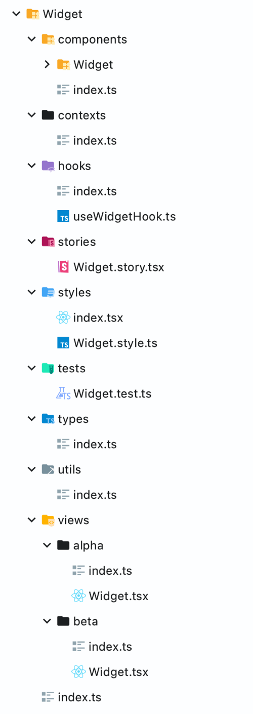
Each of our components has the same directory and file structure. Root folder and view file name of each component has a name written in PascalCase. Other folders and files are written in camelCase.

If a component uses its own components, we write it to the nested folder “components“, each nested component has the same structure as the superior one.
Hooks
When it comes to controlling particular component or widget, we use custom hooks (controller as we call it) to separate functionality from view/layout to achieve a tiny bit of clarity. With this approach, we are able to change view or controller in no time.C
Storybook
We use stories with addons (eg. info or knobs) for developmentand self documentation of our reusable components.
StyledComponents 💅
For the style of our components we use StyledComponents for its benefits — such as simple extending of styles or even theming.
Tests 🚨
- Jest
- React Testing Library
- Enzyme
Views 🖼
The component can has one more views
Why you should separate views and hooks 🤔
Main concept of hooks is to reuse the React Hooks wrapped in your custom function you want to share with other components. So Don’t Repeat Yourself. First of all You should remove React Hooks from your component (eg. useState or useEffect), create your Custom Hook and wrap them with it.
Building your own Hooks lets you extract component logic into reusable functions.
Example of separation and reusability of views and hooks
Reusable Types
{
    "dependencies": {
        "conventional-changelog-cli": "^2.1.1",
        "prettier": "^2.2.1",
        "pretty-quick": "^3.1.0"
        "devmoji": "^2.1.13",
        "husky": "^4.3.5",
        "@commitlint/cli": "^11.0.0",
        "@commitlint/config-conventional": "^11.0.0",
    },
    "husky": {
        "hooks": {
            "commit-msg": "commitlint -E HUSKY_GIT_PARAMS",
            "pre-commit": "pretty-quick --staged",
            "prepare-commit-msg": "devmoji -e --lint"
        }
    }
}
Reusable Views
const CounterView: FC<CounterProps> = ({
    count,
    increment,
    decrement,
    ...props
}) => (
    <div {...props}>
        <button onClick={decrement}>{`-`}</button>
        <span>{count}</span>
        <button onClick={increment}>{`+`}</button>
    </div>
);

const AnotherCounterView: FC<CounterProps> = ({
    count,
    increment,
    decrement,
    ...props
}) => (
    <div {...props}>
        <input type={`button`} onClick={decrement}>{`decrement`}</input>
        <strong>{count}</span>
        <input type={`button`} onClick={increment}>{`increment`}</input>
    </div>
);
Reusable Hooks
const useCounter = ({
    defaultCount = 0,
    onIncrement,
    onDecrement,
}: useCounterProps): CounterProps => {
    const [count, setCount] = useState<number>(defaultCount);

    const increment = () => {
        setCount((prev) => prev + 1);
        onIncrement?.();
    };

    const decrement = () => {
        setCount((prev) => prev - 1);
        onDecrement?.();
    };

    return {
        count,
        increment,
        decrement,
    };
};

const useDoubleCounter = ({
    defaultCount = 0,
    onIncrement,
    onDecrement,
}: useCounterProps): CounterProps => {
    const [count, setCount] = useState<number>(defaultCount);

    const doubleIncrement = () => {
        setCount((prev) => prev + 2);
        onIncrement?.();
    };

    const doubleDecrement = () => {
        setCount((prev) => prev - 2);
        onDecrement?.();
    };

    return {
        count,
        increment: doubleIncrement,
        decrement: doubleDecrement,
    };
};

const useTimerCounter = ({
    interval = 1000,
    ...useCounterProps
}: useTimerCounterProps): CounterProps => {
    const counterProps = useCounter(useCounterProps);

    useEffect(() => {
        setInterval(counterProps.increment, interval);
    }, [interval]);

    return {
        ...counterProps,
    };
};
Reusable Component (wrapped views and hooks)
const SingleCounter = () => {
  const counterProps = useCounter({});
  return <CounterView {...counterProps} />;
};

const AnotherSingleCounter = () => {
  const counterProps = useCounter({});
  return <AnotherCounterView {...counterProps} />;
};

const DoubleCounter = () => {
  const counterProps = useDoubleCounter({});
  return <CounterView {...counterProps} />;
};

const TimerCounter = () => {
    const counterProps = useTimerCounter({});
    return <CounterView {...counterProps} />;
};
. . .
Theme 🎨
We have tried a lot of solutions for naming of colors, sizes and other theme things and we came to the conclusion.Theme object containing information about colors and sizes (width, height, font-size) or paddings,.. you got the point. With these theme fields you can easily create light and dark theme or other specific themes.
export type DefaultThemeType = {
    readonly color: ColorType;
    readonly padding: SpacingType;
    readonly margin: SpacingType;
    readonly radius: string;
    readonly rounded: string;
    readonly font: {
        readonly size: FontSizeType;
        readonly family: string;
    };
    readonly height: DimensionsType;
    readonly width: DimensionsType;
    readonly boxShadow: BoxShadowType;
};
export type ThemeType<T = undefined> = DefaultThemeType & { custom: T };
export type BoxShadowType {
    sm: string;
    md: string;
};
export type ColorType = {
    default: string;
    border: string;
    primary: {
        alpha: string;
        beta: string;
        gamma: string;
        delta: string;
        epsilon: string;
    };
    success: {
        alpha: string;
        beta: string;
        gamma: string;
        delta: string;
        epsilon: string;
    };
    warning: {
        alpha: string;
        beta: string;
        gamma: string;
        delta: string;
        epsilon: string;
    };
    error: {
        alpha: string;
        beta: string;
        gamma: string;
        delta: string;
        epsilon: string;
    };
    text: {
        alpha: string;
        beta: string;
        gamma: string;
        delta: string;
        epsilon: string;
    };
    background: {
        alpha: string;
        beta: string;
        gamma: string;
        delta: string;
        epsilon: string;
    };
};
export type DimensionsType = {
    xs: string;
    sm: string;
    md: string;
    lg: string;
};
export type FontSizeType = {
    sm: string;
    md: string;
    lg: string;
};
export type SpacingType = {
    xs: string;
    sm: string;
    md: string;
    lg: string;
    xl: string;
};
Colors 🖍
We divide colors to primary, which is the main color of the project, colors of text and backgrounds. These colors are project specific and have their own state color types like success, warning and error (these are the same for most of our projects).
For shades of specific color types we chose naming after Greek alphabet. It’s not necessary to be shade, it could be a totally different color but then it would stand out of the pattern which is not exactly what we are trying to achieve.
Why 🤔
Because there could be a use-case with light/dark theme, where background beta in the light theme is different shade than beta of dark theme.
Sizes 📏
Size types are divided to xs (extra small), sm (small), md (medium), lg (large) and xl (extra large) keys. This naming lets you define constants for height, width, paddings, margins, etc. And you can use them in StyledComponents with ease.
. . .
Breakpoints 💻 👉📱
In our team we have decided to not use CSS media-queries. We use device and resolution specific methods like matchMedia() in our projects.
Our approach 💡
As I mentioned above, we use detection of client breakpoint in JavaScript. We created components (mobile, tablet, laptop and desktop) where each represents a type of device. These React components render their children on specific device type.
We wrote a device context which provides an object with information about currentDevice or boolean isTouchable.
Why not simply use CSS media queries without JavaScript? 🤔
const App = () => (
	<>
		<Desktop>
			<ExpensiveComponent />
		</Desktop>

		<Mobile>
			<LightWeightComponent />
		</Mobile>

		<Device devices={['mobile', 'desktop']}>
			<ComponentForMultipleDevices />
		</Device>
	</>
);
This example shows usage of this solution. Imagine you have a really expensive component (it could be memoized), which is rendered on FullHD and higher resolution and another component, which is rendered on mobile phones. So, client is on mobile phone and with basic css media queries you have to run all the logic of the ExpensiveComponent function and after that you’ll set css attribute eg. display: none or something, which is particularly wrong solution (at least for us) for debugging and performance.
With JavaScript breakpoint solution you can determine specific logic for specific device
. . .
GraphQL 📡
We use GraphQL API to communicate with our servers. We chose GraphQL for the self documentation, type safeness and client-driven development..
GraphQL Code Generator ♻️
This library is just pure heaven, in combination with GraphQL, Apollo Client and Typescript, you can save hours and hours of writing your own Typescript schema with this library. This library takes GraphQL schema or operation as an input and it generates static types, functions or specific hooks/components for you which you can use out of the box. It’s that simple.
GraphQL Code Generator config
overwrite: true
schema: schema.graphql
documents: 'src/graphql/**/*.graphql'
generates:
    src/graphql/generated/index.tsx:
        plugins:
            - 'typescript'
            - 'typescript-operations'
            - 'typescript-react-apollo'
            - 'fragment-matcher'
        config:
            withHooks: true
            withHOC: false
            withComponent: false
            apolloClientVersion: 3
            apolloReactHooksImportFrom: '@apollo/client'
            apolloReactCommonImportFrom: '@apollo/client'
            scalars:
                Long: number
Apollo 🅰️
We think the Apollo client (whole platform) is the best way in terms of communication with GraphQL APIs. Apollo client for React has plenty of hooks which help you define GraphQL operations (queries, mutations and subscriptions), so with this client your App can easily fetch or re-fetch and even mutate data or listen on sockets via subscriptions. You can work with Apollo cache itself and manipulate the data out of the box.
. . .
Forms 📋
We have experience with both React Hook Form and Formik which are the most famous libraries for form management in React. Both of them support Yup schema objects, which is really cool for validations, default values and it’s pretty simple to test. Our choice for next projects is React Hook Form, because of the documentation, clarity and it has better support of React Hooks.
. . .
State Management 🗄
We don’t need any state management libraries like Redux or MobX for sharing state between components in our projects.
We use React State shared by React Context for sharing state between components, Apollo cache for data from our GraphQL API, React Hook Form for data of our forms and what about persistence? We simply use local or session storage.
. . .
Routing 🗺
There are some routing libraries for React, the most known is React Router, we use this library in many projects. We also use Reach Router in our projects, but the new version of React Router (v6) and React Router will be merged. 🎉 (maybe it already is)
. . .
Translations 🌐, dates 📆 and times ⏰
For internalization in our projects we use the I18next framework for React, it’s really easy to use and their Provider component provides translations across the whole app, with useTranslation hook you can access the translation function or i18n object. And what about dates and times? As many developers we use the most famous and largest library moment.js. If you’re looking for something smaller (with the same API), you can add day.js to your dependency list, just like us in our new projects.
. . .
Optimization ⚡️
In Atlas, we have experience with displaying large data such as lists or even hierarchical lists (trees), we use libraries like React Virtualized or React Window for better performance results and also we use memoized values via useMemo or useCallback hooks.
. . .
Our NPM packages 📦
Our projects are dependent on our custom NPM packages, which contain handy stuff like utils, functions, modules and reusable components that we share throughout our own ecosystem.
@atlasgroup/react-atlantic 🌊
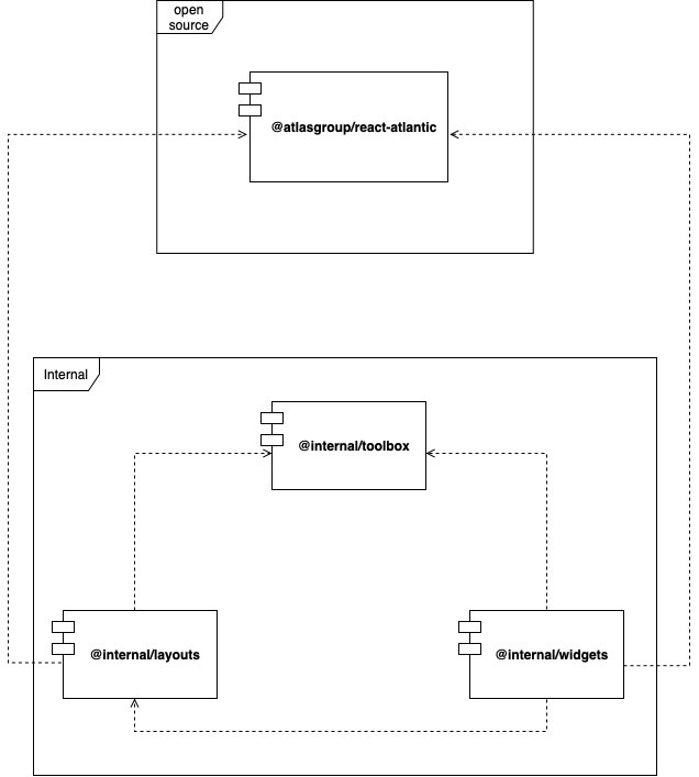
Our first package is an open-source component library. Our Widgets (more complex components) are built using basic components (eg. buttons, inputs, typography etc.) from the library. All of our projects are dependent on this library.
Internal Packages ❤️
We also have more custom libraries, on our local npm registry, which isn’t public. These libraries are built for sharing some utils or more complex components between our projects. Down below you can see some of them.
@internal/toolbox 🛠
This library contains many utilities and Custom Hooks for React, which are used across our projects.
@internal/layouts 🧱
In this library we define StyledComponents for our reusable layouts, which are used for pages, widgets etc.
@internal/widgets 🧩
Our widgets are more complex components, which are composed of components from @atlasgroup/react-atlantic. The components are organized by our library @internal/layouts and are also dependent on our @internal/toolbox. These widgets are shared across our projects. To point out one of them then the Calendar component is a great candidate to make an example of.
Dependency diagram

Thank you for your time. ⌛ Leave a comment 💬 and tell us about your React ecosystem and best practices and know-how.
Chcete být informováni o novinkách? Odebírejte náš newsletter.
[social_warfare]